A strategic approach for building a design system improving product fluency.
SERVICES WE PROVIDED UX Research Service Design UI Re-Design App Development
Overview
The design system for Brandintelle is a set of standards to manage design at scale by reducing redundancy while creating a shared language and visual consistency across different pages and channels.
what was needed
Brandintelle lacked a comprehensive design system that unified the brand prior to an update. The design system at that time was fragmentary, lacked consistency, and was partially outdated. Additionally, the old documentation left much open to interpretation.
As a result, the product, brand, and engineering teams lacked a shared foundation around process, design language, guidelines, and UI pattern libraries. This created inefficiencies for each team, as well as inconsistencies within the product.
WHAT WAS THE CHALLENGE?
The challenge was to create a design system that
Aligned our team by giving them a more structured and guided way to build products.
Speed up our design and development process: with a ready-made library and patterns teams can create and test layouts much faster.
Improve brand perception and user trust through consistent experiences that work for everyone and allow users to accomplish their goals.
Promote accessibility of our products by building accessibility and inclusion into our component libraries, both from a design and code repository perspective.
STRATEGY
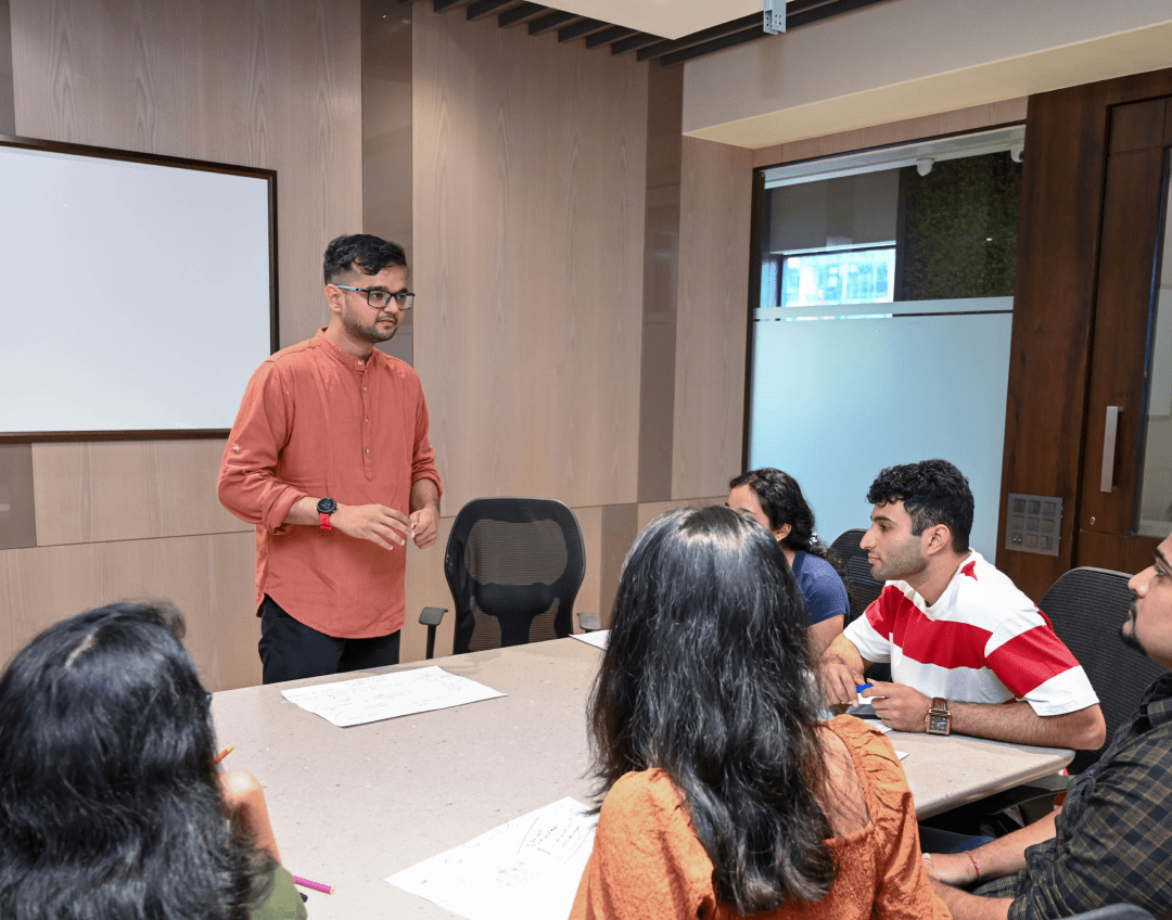
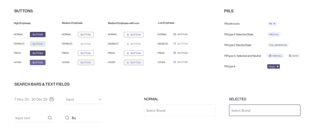
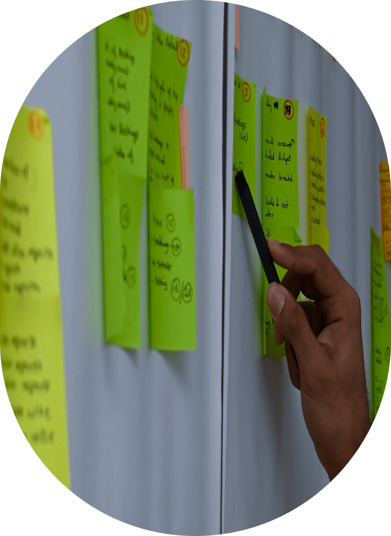
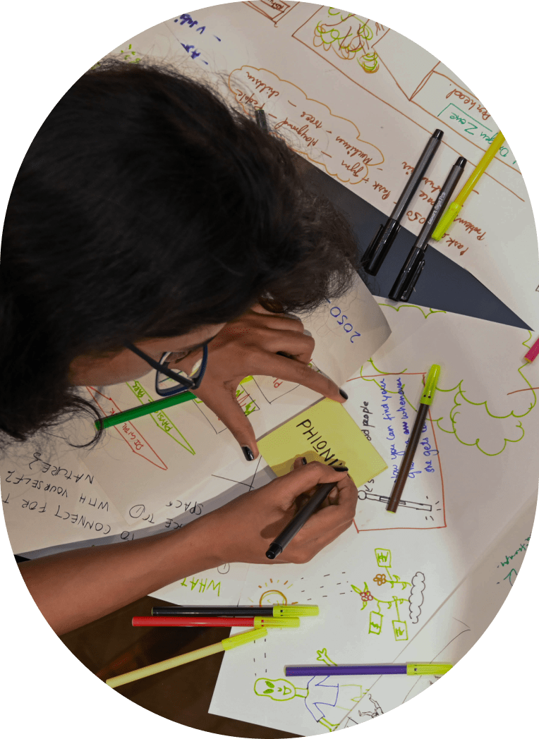
First we visited the product and went through the flow to get a rough idea. Then we started with the design foundation. We decided to focus first on the foundational elements (atoms) of our design system, such as color palettes, fonts, grid, spacing, buttons, etc., and then move on to more complex blocks and pieces (molecules, organisms, templates, pages).
Some of the activities at this stage involved:
Researching other design systems and interfaces for components common practices and inspiration.
Analyzing the instances and use cases captured during the audit and ideating on the solutions that serve our goals best.
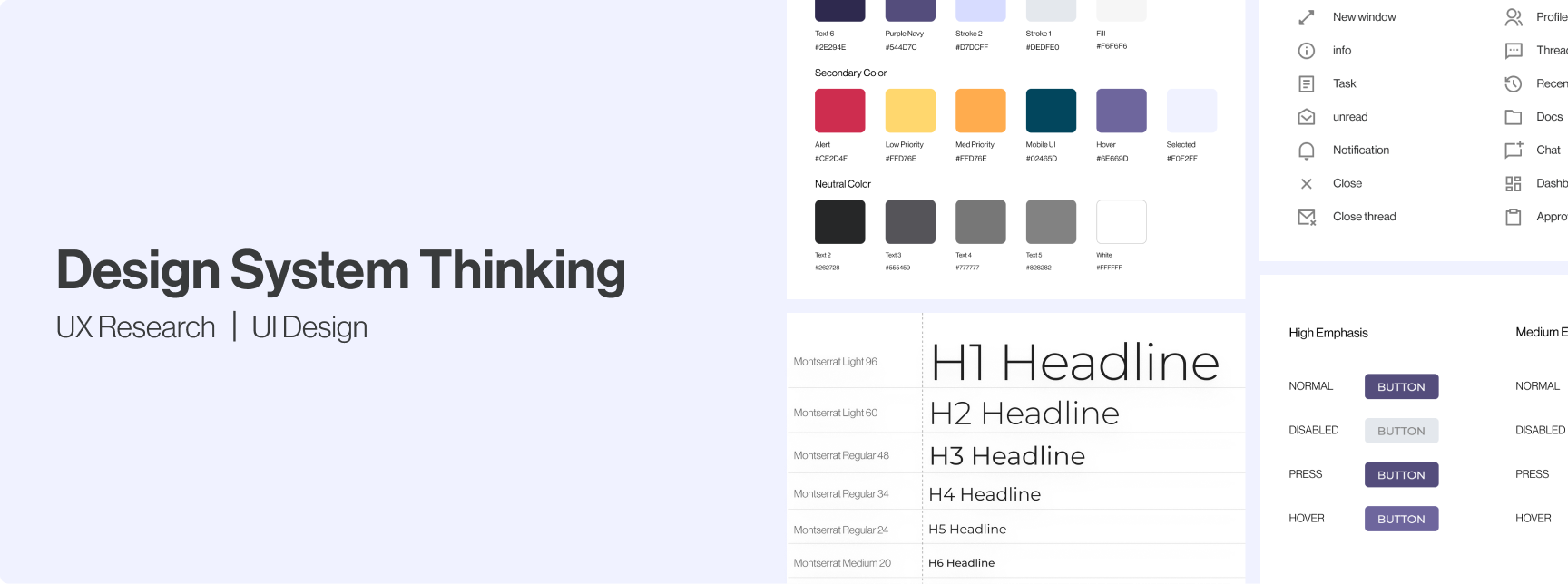
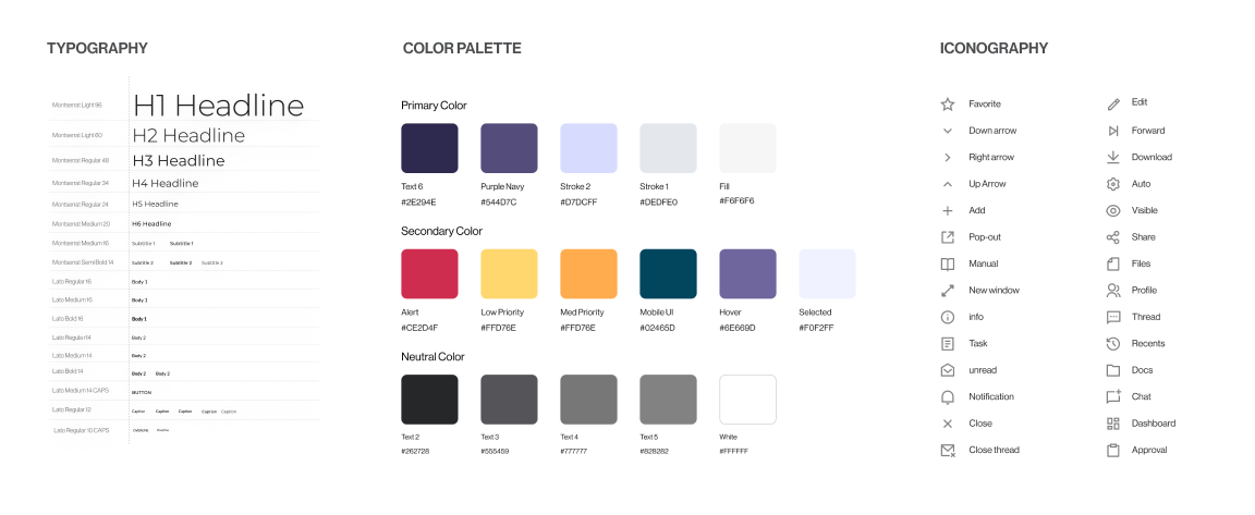
Unifying: we merged different variations of components to leave only the essentials. For example, we limited our color schemes to a maximum of 9 shades for each hue and all the excessive variations were matched and merged with the decided upon schemes based on proximity. Below is our final color palette:
THE FUTIURE
The design system is an ongoing project. We iterate, change and learn a lot in the process. So far, we have a set of basic components ready, which has been game-changing for our team in terms of efficiency, as well as consistency, and standardization.
Some of our team’s next steps include:
Continuing to grow our component library and supplement it with more complex components.
Adding sections on brand, illustrations and animation.
Cultivating processes and best practices for maintaining the documentation to ensure that our library stays up to date and perfectly in sync both on the design and code side.
Raising awareness across the teams and promote adoption and contribution to the documentation.
Building processes for testing the components on compliance with guidelines and accessibility standards.
A strategic approach for building a design system improving product fluency.
SERVICES WE PROVIDED
UX Research
Service Design
UI Design
App Development
Overview
The design system for Brandintelle is a set of standards to manage design at scale by reducing redundancy while creating a shared language and visual consistency across different pages and channels.
what was needed
Brandintelle lacked a comprehensive design system that unified the brand prior to an update. The design system at that time was fragmentary, lacked consistency, and was partially outdated. Additionally, the old documentation left much open to interpretation.
As a result, the product, brand, and engineering teams lacked a shared foundation around process, design language, guidelines, and UI pattern libraries. This created inefficiencies for each team, as well as inconsistencies within the product.
WHAT WAS THE CHALLENGE?
The challenge was to create a design system that
Aligned our team by giving them a more structured and guided way to build products.
Speed up our design and development process: with a ready-made library and patterns teams can create and test layouts much faster.
Improve brand perception and user trust through consistent experiences that work for everyone and allow users to accomplish their goals.
Promote accessibility of our products by building accessibility and inclusion into our component libraries, both from a design and code repository perspective.
STRATEGY
First we visited the product and went through the flow to get a rough idea. Then we started with the design foundation. We decided to focus first on the foundational elements (atoms) of our design system, such as color palettes, fonts, grid, spacing, buttons, etc., and then move on to more complex blocks and pieces (molecules, organisms, templates, pages).
Some of the activities at this stage involved:
Researching other design systems and interfaces for components common practices and inspiration.
Analyzing the instances and use cases captured during the audit and ideating on the solutions that serve our goals best.
Unifying: we merged different variations of components to leave only the essentials. For example, we limited our color schemes to a maximum of 9 shades for each hue and all the excessive variations were matched and merged with the decided upon schemes based on proximity. Below is our final color palette:
THE FUTIURE
The design system is an ongoing project. We iterate, change and learn a lot in the process. So far, we have a set of basic components ready, which has been game-changing for our team in terms of efficiency, as well as consistency, and standardization.
Some of our team’s next steps include:
Continuing to grow our component library and supplement it with more complex components.
Adding sections on brand, illustrations and animation.
Cultivating processes and best practices for maintaining the documentation to ensure that our library stays up to date and perfectly in sync both on the design and code side.
Raising awareness across the teams and promote adoption and contribution to the documentation.
Building processes for testing the components on compliance with guidelines and accessibility standards.